Lean Landing Page
Simple Landing Page checklist and playbook to💡test your idea, 🪜validate your MVP and go from 📈 visitors to customers.
What's On?
- A step-by-step guide to building high converting landing page
- Actionable tips for building a great landing page
- Checklist to increase website conversions organically
- Ultimate landing page checklist for SaaS companies
A step-by-step guide to building high converting landing page
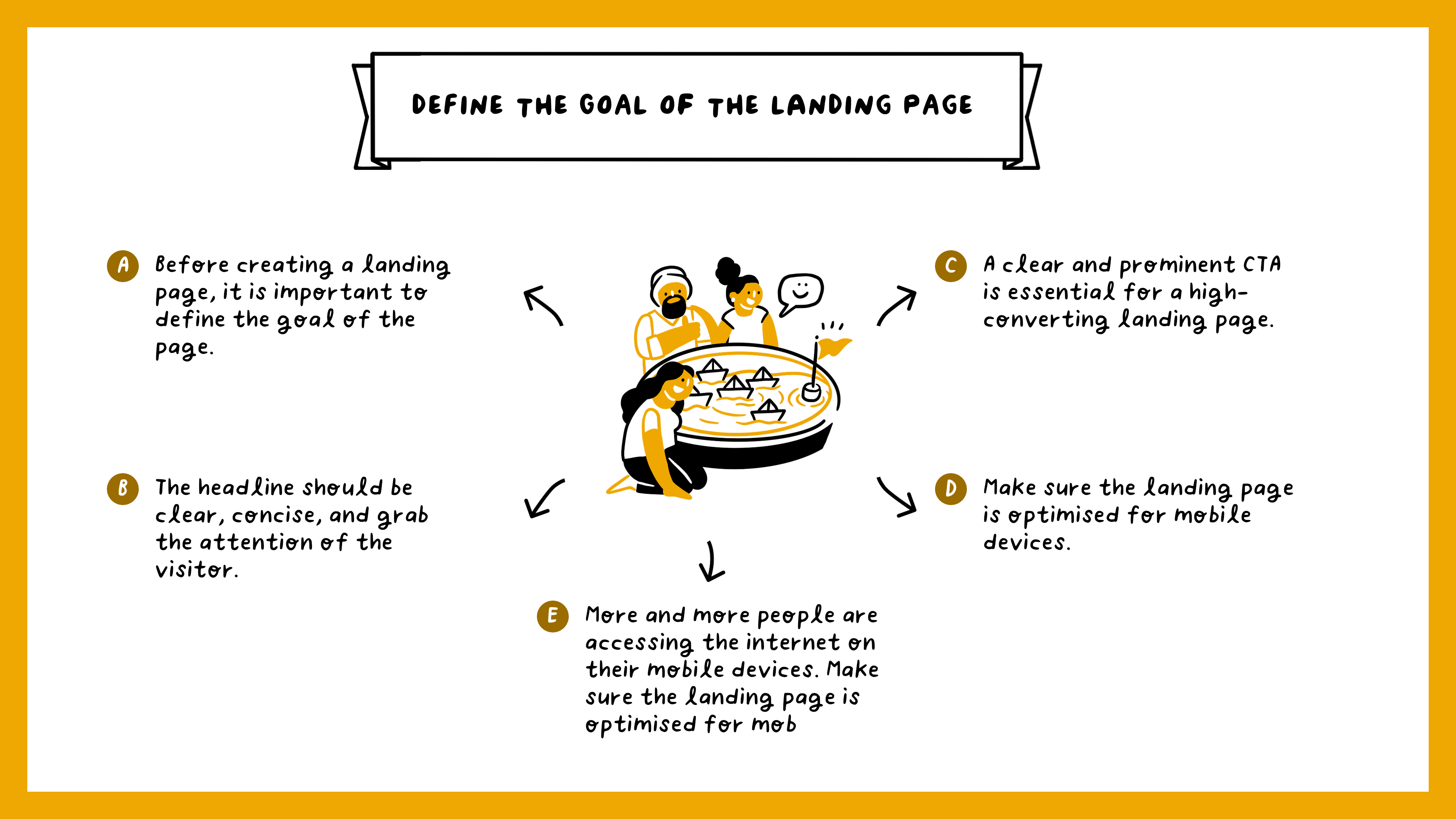
- Define the goal of the landing page: Before creating a landing page, it is important to define the goal of the page. The goal could be to generate leads, increase sales, or promote a specific product or service.
- Choose a template: Select a template that is visually appealing and easy to navigate. There are many landing page builders that offer pre-designed templates to choose from.
- Optimise the headline: The headline should be clear, concise, and grab the attention of the visitor. It should also reflect the goal of the landing page.
- Use images and videos: Visuals are a great way to grab the attention of visitors. Use high-quality images and videos to showcase your product or service.
- Include a call-to-action (CTA): A clear and prominent CTA is essential for a high-converting landing page. The CTA should be placed above the fold and be easy to find.
- Use testimonials: Testimonials from satisfied customers are a great way to build trust and credibility.
- Make the form simple: If the goal of the landing page is to generate leads, include a simple form that is easy to fill out.
- Optimise for mobile: More and more people are accessing the internet on their mobile devices. Make sure the landing page is optimised for mobile devices.
- Test and optimise: Once the landing page is live, test and optimise it to improve conversion rates. A/B testing can be used to test different elements of the page, such as the headline, images, and CTA.
- Monitor and analyse: Monitor the performance of the landing page and analyse the data to identify areas for improvement. Use tools such as Google Analytics to track visitors, conversions, and bounce rates.
Actionable tips for building a great landing page
Checklist to increase website conversions organically
Design
Social Proof + Trust Badges
Product Pages
Collection Pages
Payment + Checkout
Now go through your website, tick all these boxes and track your conversions!
Ultimate landing page checklist for SaaS companies
🚀
Headline
A clear and compelling headline that communicates the main benefit of your product or service.
💻
Hero Image
A high-quality image or video that visually represents your product or service.
💪🏽
Features
A clear and concise list of the features and benefits of your product or service.
😻
Testimonials
Social proof from satisfied customers in the form of testimonials or case studies.
👩⚕️
Call to action (CTA)
A clear and prominent CTA that encourages visitors to take the next step, such as signing up for a free trial or scheduling a demo.
📝
Form
A simple and easy-to-use form that collects the necessary information from potential customers.
🪜
Navigation
A clear and easy-to-use navigation menu that guides visitors to relevant pages on your website.
📱
Mobile-responsive design
A design that is optimised for mobile devices to ensure a seamless user experience.
📣
Branding
Consistent branding throughout the landing page, including the company's logo, colour scheme, and tone of voice.
👀
Optimised for SEO
Optimised meta tags, keywords, and title tags to help improve search engine rankings and visibility.
📊
Tracking and analytics
Tracking and analytics tools to measure the performance of the landing page and make data-driven decisions for optimisation.
🚗
Accessibility
Compliance with accessibility standards to ensure that the landing page is usable by people with disabilities.
🏎️
Speed
The page should load quickly and be optimised for fast load times.
⏰
Urgency
Use urgency elements like countdown timers to create a sense of urgency and encourage visitors to take action.
👨🏻💻
Clear language
Use simple, clear language to communicate the value of your product or service to visitors.
📌
Security
Use of secure protocols and certifications to ensure the safety of visitors' personal information.
📈
Follow-up
A plan to follow up with visitors after they've submitted a form to ensure they are aware of next steps.
👨🏻💻 👩🏻💻
Build + Launch your startup 🚀
Join 900+ founders building and launching their startups NOW!
We've packed Founders' Book with everything to turn your pony idea into a unicorn🦄
$299 /year
Price in USD, taxes included.
😻 Full and unlimited access to Founders' Book
🚀 Everything you need to accelerate your startup
⏰ Save 200+ hours of research and googling
📈 Plan and build your startup with a variety of Notion templates
💸 Save up to $500K across 200+ SaaS tools
👩🏻💻 Non-Technical founder and solopreneur-friendly
🔑 Access to all future content and product updates
🤝 Get priority support
Copyright © 2023 Founders' Book. All rights reserved.

